Principles
Three rules every illustration is held against, regardless of category.
01
Specific, not generic
A clock for always-on. A foot stomp for fees. The illustration depicts the concept literally, not a vague feeling about it.
02
Functional, not decorative
Earn the space. If a heading + a sentence already says the thing, the illustration is the wrong tool. Reach for it when language alone leaves the meaning flat.
03
Honest, not aspirational
Real product surfaces, real shop owners, real receipts. We don't draw what Flatpay aspires to be — we depict what it actually does.
Where they live
Both illustration categories show up on flatpay.com, in marketing collateral, blog posts, customer stories, and onboarding. Neither belongs in dense product UI: catalog rows, table cells, dashboards. Restraint is the brand.
Spot illustrations
A small, monochrome ink drawing on a single pastel surface. Each spot illustration depicts one concrete object or action that visualizes a feature literally — a clock for always-on availability, a foot stomp for killing fees, a chaise lounge for daily payouts. They humanize without becoming twee.
Anatomy
- LineBlack ink, organic, hand-drawn-feeling. Slight imperfection in the stroke weight is intentional — it's what keeps the artwork from looking like a stock icon.
- FillThe drawing itself is mostly outlined. The one fill is the cast shadow — a solid black blob anchoring the object to a ground plane. Without the shadow, the illustration floats and reads as decoration.
- SurfaceA single soft brand color fills the tile behind the artwork. Pull from
color/green/200,color/pink/200,color/blue/200,color/yellow/200, orcolor/natural/100. Never on white — the soft tile is part of the illustration. - FrameSquare or near-square. Generous internal padding so the artwork breathes. Centered in the tile.
When to use
Use for
- Feature tiles on the marketing homepage.
- Empty states that need a softer touch — onboarding cards before a merchant has any data.
- Blog post hero images.
- Section breaks in long-form pages (pricing, help center).
Don't use for
- Dense product UI — catalog rows, table cells, dashboards.
- List items, navigation, buttons, or status pills.
- Anywhere the user is mid-task.
- Decoration without a literal concept tied to it.
Library
Five in active rotation on flatpay.com. Each illustration earns its place by standing for a single feature.

Always on
24/7 customer support.

Flat rate
One predictable rate, every card type.

No hidden fees
No surprises in the statement, guaranteed.
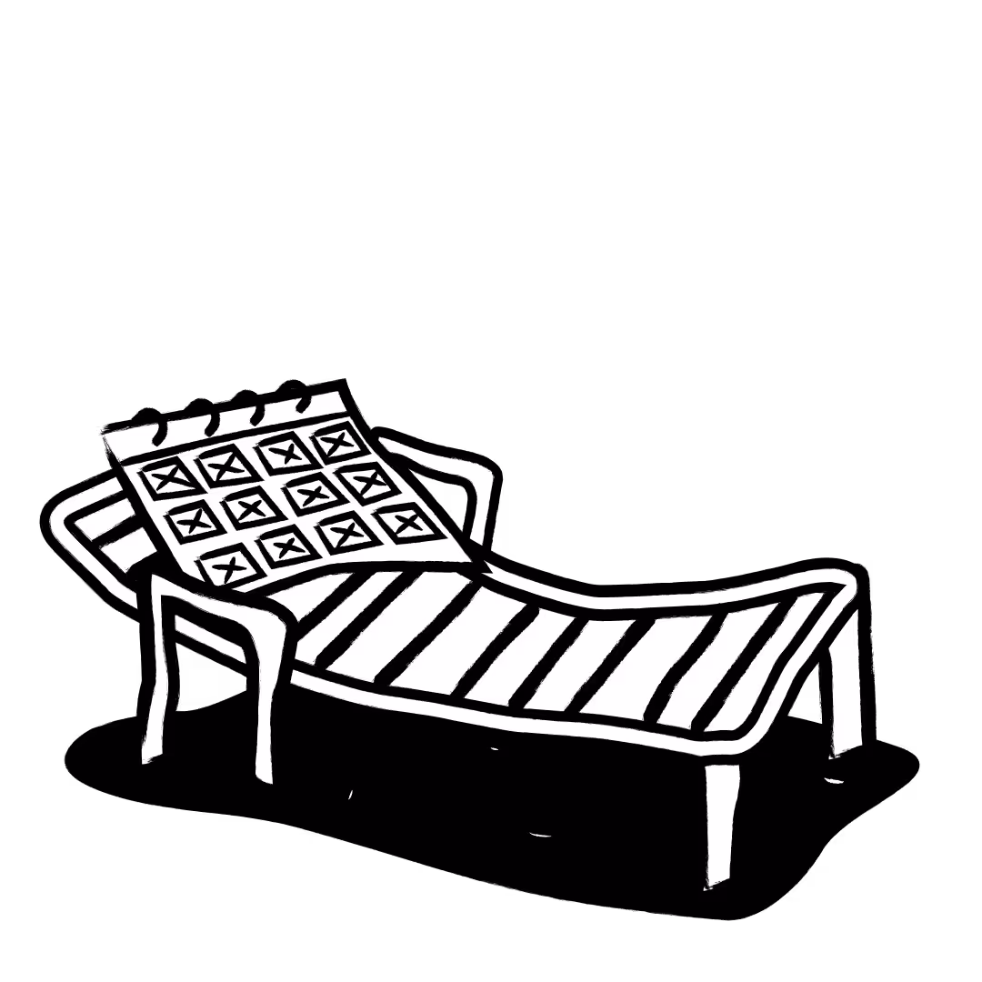
Daily settlements
Funds settle into your bank, every day.

Footer
The closing illustration on flatpay.com — a small celebratory scene.
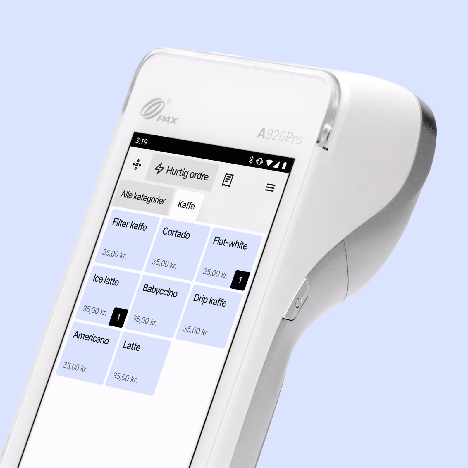
Spotlight UI
Real product surfaces — checkout sheets, the POS terminal, kitchen receipts, table-management cards — composed and lit so the product itself becomes the illustration. Sometimes against a flat brand color, sometimes layered over a photographic context that grounds the product in a real merchant's shop.
Anatomy
- SubjectAn actual screen from the product, or actual hardware (the Pax terminal). Never a stylized representation; never a generic dashboard mock.
- SurfaceEither a flat brand color (mint, beige, pink) or a photographic background showing the merchant's context — kitchen, market stall, restaurant counter. Photographic backgrounds carry warmth that flat colors can't.
- LayeringMultiple UI elements often overlap — a receipt slightly tilted in front of a card list, a payment-method tile floating above a terminal. The composition suggests motion: this is the product in use, not a frozen mock.
- LightingSoft, generous shadows on the floating elements. The shadows say "these are real surfaces," not "these are stickers".
When to use
Use for
- Marketing homepage hero — show the product in action.
- Product launches and feature announcements.
- Customer story headers — pair the merchant with their actual UI.
- Pricing page detail blocks where the surface itself is the proof.
Don't use for
- In-product help tooltips or modal dialogs.
- Empty states inside the product — that's spot territory.
- Anywhere the actual product is one click away.
- Decorative filler — if the screenshot doesn't teach something, drop it.
Library
Eight compositions from flatpay.com. Each pairs a real product surface with the context that makes it credible — checkout, terminal hardware, kitchen receipts, mPOS table flows.
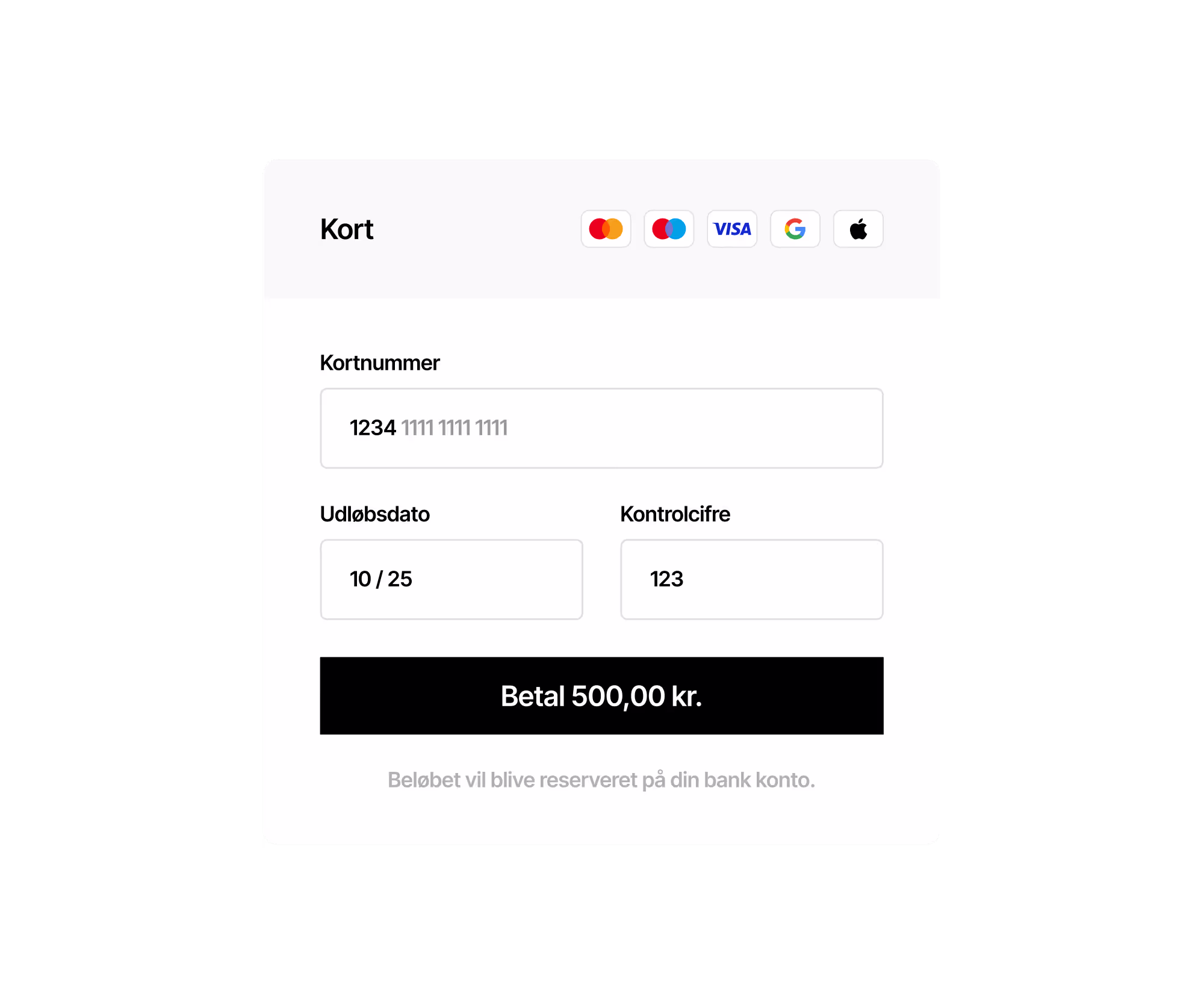
Online checkout
The hosted payment sheet — the surface every online merchant ships to customers.

Terminal · We got you
Terminal hardware composed with a feature claim — the in-counter workhorse.
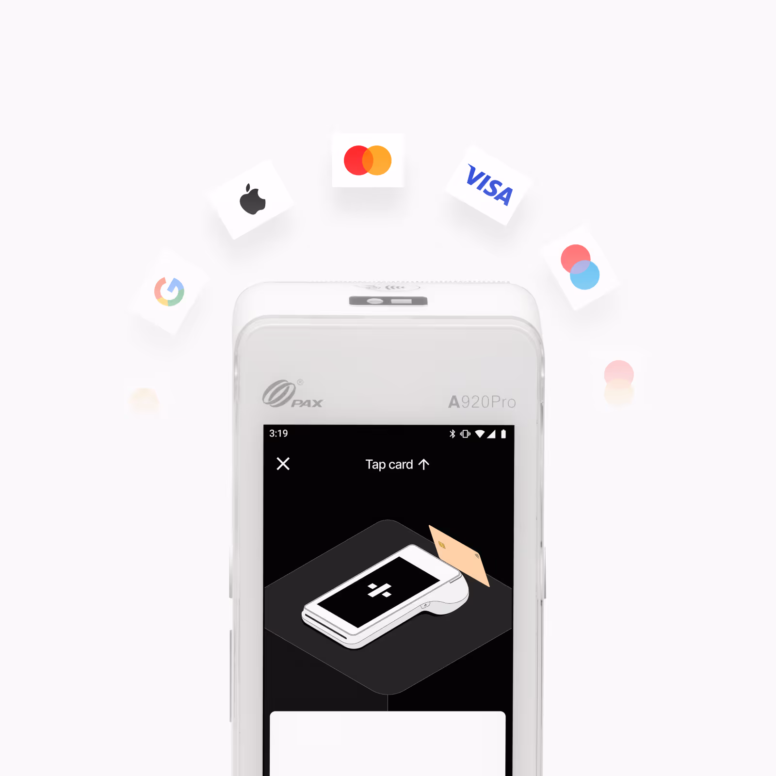
Terminal · Accept all cards
Card networks orbiting the terminal — feature-specific composition.

Terminal · Goodbye hassle
A second terminal feature — same hardware, different promise.
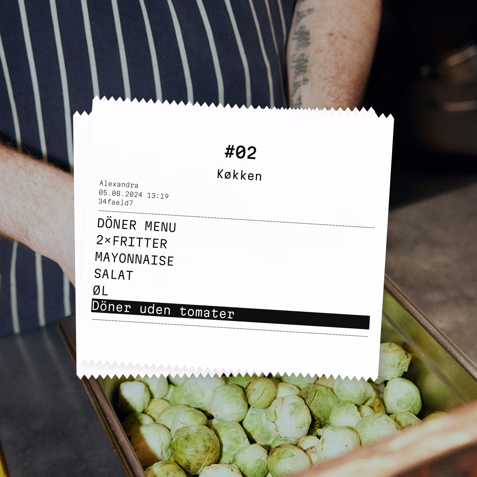
Kitchen receipt
Printed kitchen ticket on a food-service counter — POS + context photo.

POS · Low fees
POS UI paired with a low-fees claim — the merchant-side argument.
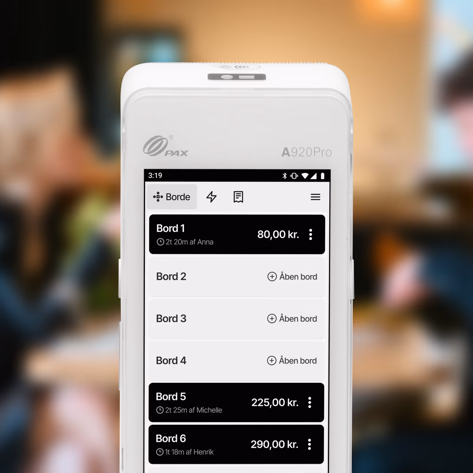
mPOS · Table management
Table overview from the mPOS app — restaurants and bars.
mPOS · Familiar
The mPOS interface anchored to the familiar-feeling claim.
Choosing between them
The two categories aren't interchangeable. The choice depends on what the surface is asking the reader to do.
| If you want to… | Spot | Spotlight UI |
|---|---|---|
| Communicate a feature in the abstract | ✓ | — |
| Show the product in actual use | — | ✓ |
| Soften an empty state | ✓ | — |
| Anchor a marketing hero | — | ✓ |
| Add personality to a long article | ✓ | — |
| Prove a flow works | — | ✓ |
| Tell a feature story across multiple tiles | ✓ | — |
| Pair the product with a real merchant context | — | ✓ |
House rules
Do
Treat illustrations as a budget. One spot per feature tile, one spotlight per marketing surface. The brand stays distinctive when illustrations are rare — the more often they appear, the less they say.
Don't
Don't mix the two on the same surface — a spot illustration next to a spotlight composition reads as visual confusion. Don't recolor spot illustrations beyond the approved pastel set. Don't use icon libraries (Heroicons, Lucide) as a substitute for a spot illustration; an icon is for an action, an illustration is for a concept.